
Validity Engage
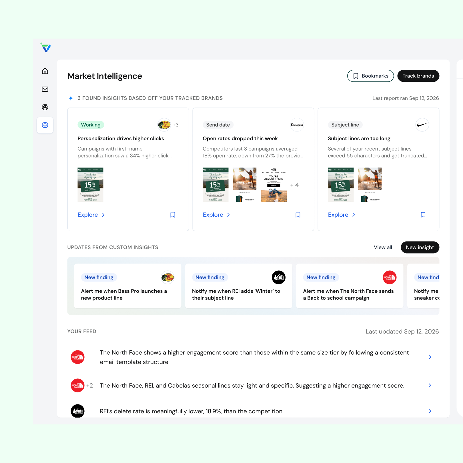
Email marketers track a few competitors but can't see how their industry is shifting or how their program stacks up. Validity had 25+ years of email data (2.5B+ data points across 30,000+ brands) that could answer those questions, but no AI product to put it in marketers' hands. Engage, a new agentic AI platform, was that product. I designed its Market Intelligence agent from 0 to 1 in 6 months.
- Lead product designer for the Market Intelligence agent
- Ran a two-day assumption-mapping workshop with developers, data scientists, and a PM to align on the MVP
- Validated product-market fit with leadership, SDRs, AMs, and beta users
- Built live-coded prototypes with Claude + VS Code and helped standardize a design system shared by the agents
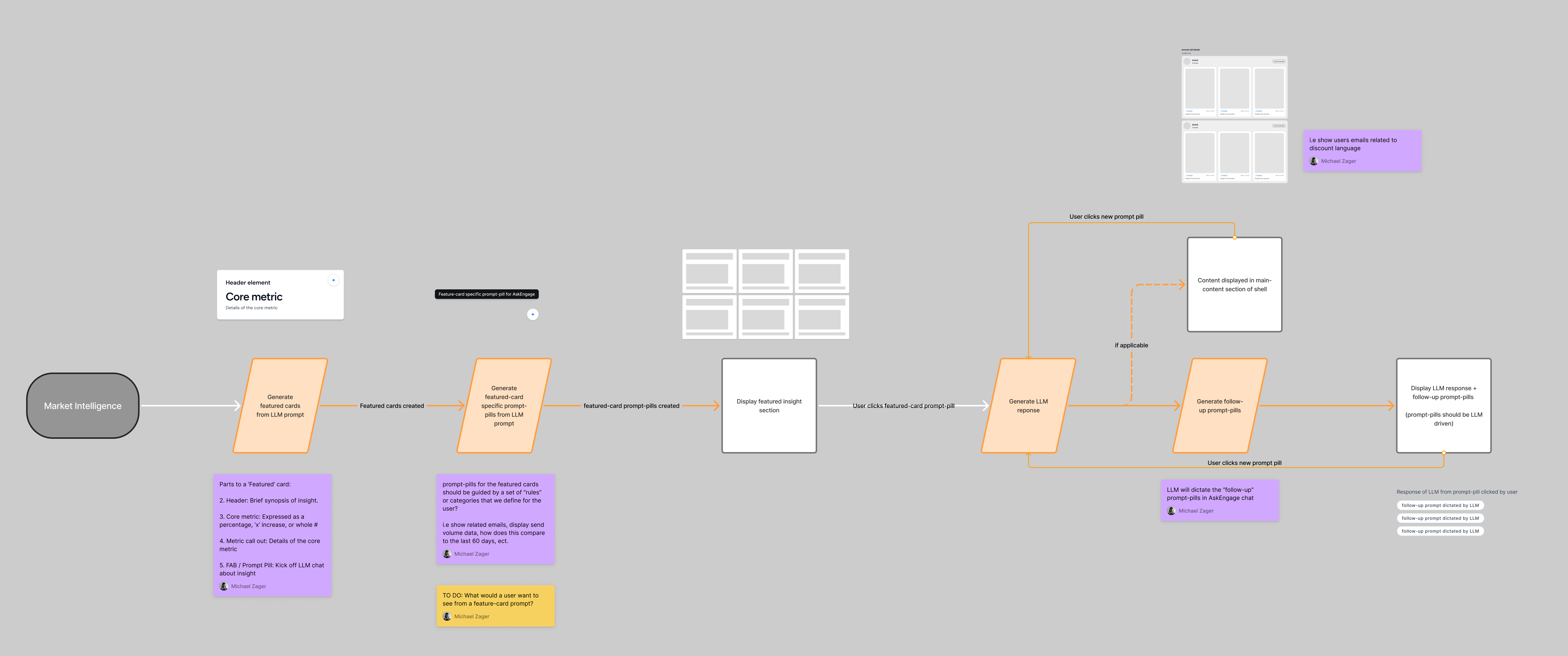
- Value on first view. Featured Insights are the first thing users see, so I grounded them in what marketers care about (industry trends and competitor benchmarks) and what the LLM could pull reliably (6 scored categories and email creatives).
- A core UX loop. Insight card → insight page → AskEngage follow-up questions. The loop gives users depth and also drives credit consumption, the business model.
- Charts cut from the MVP. Data visualization and rankings would have added significant data and dev work, so we shipped email creatives plus AskEngage first to stay focused on the core vision.
- Time to value over self-serve setup. We configured each user's company and tracked brands on the back end at first, then built the front-end setup later.
- Prototyping in code. It sped up iteration and got stronger stakeholder buy-in, but made work harder to see and hand off. A living branch-history page and a branch naming convention fixed the visibility.
Feedback from leadership, sales, and beta users showed that insights skewed quantitative, didn't separate easy wins from strategic findings, padded out a fixed set of six cards, and hid the emails behind them. The next iteration:
- Replaced the required metric with a dynamic label, heading, and subheader so insights could cover qualitative shifts like launches and repositioning
- Added brand logos and email creative thumbnails to invite exploration
- Removed the "AI-gradient" styling to reduce clutter
- Swapped prompt pills for an explore + bookmark footer that opens the insight page with an AskEngage response already started
- Launched three core features (Featured Insights, Custom Insights, and Signal Feed) that save marketers hours of competitive research
- The core UX loop became the pattern for all Engage agents and for AskEngage across the app
- My card and layout exploration shaped Engage's visual language and design system
- Next: make insights more actionable, deliver them in Slack or Claude, and track credit use, time to first insight, and AskEngage engagement
The platform is new, so I don't have much historical data. But these are the metrics I was aiming for
Email marketers keep an eye on a few competitors but struggle to see the bigger picture of what's shifting in their industry and how their program stacks up in the market. Validity had 25+ years of email data that could answer those questions, but no AI experience to put it in marketers' hands.
- Lead product designer for market intelligence agent
- Collaborate with SDRs, AMs, and key stakeholders to validate product-market fit
- Collaborate with the design team to build, scale, and standardize design systems for multi-agent use
Developed a core UX loop
The featured insight work informed future implementations and thinking not only for the market intelligence agent but also for our other two agents and how users interact with AskEngage across the app.
Informed visual design and UI direction for the app
With no visual design or UI direction in place, my exploration of the tool helped inform team discussions and decisions on Engage's design system and visual language.
Improved my personal process
Using Claude + VS Code sped up my iteration and time-to-value for users, enabling faster learning and improvements.
The platform is new, so I don't have much historical data. But these are the metrics I was aiming for
Why Launch a New Product?
Validity has a suite of tools and services addressing the full email lifecycle. In its current state, Validity lacked an AI angle for its existing platform and felt it was lagging behind the competition and how email teams were working in the new AI era. Enter the Validity Engage Platform. The Engage platform has three core agents that address email marketers' needs in both pre-send and post-send workflows.
The Market Intelligence agent keeps users up to date on what is happening in the email landscape from a strategic perspective, trained on the Validity Intelligence Network.
The Validity Intelligence Network is a network of global email signals from every inbox across the world. With 25+ years of data, over 2.5 billion data points, and 30,000+ brands, the Validity Intelligence Network is the foundation the Market Intelligence agent uses.
A Proof of Concept
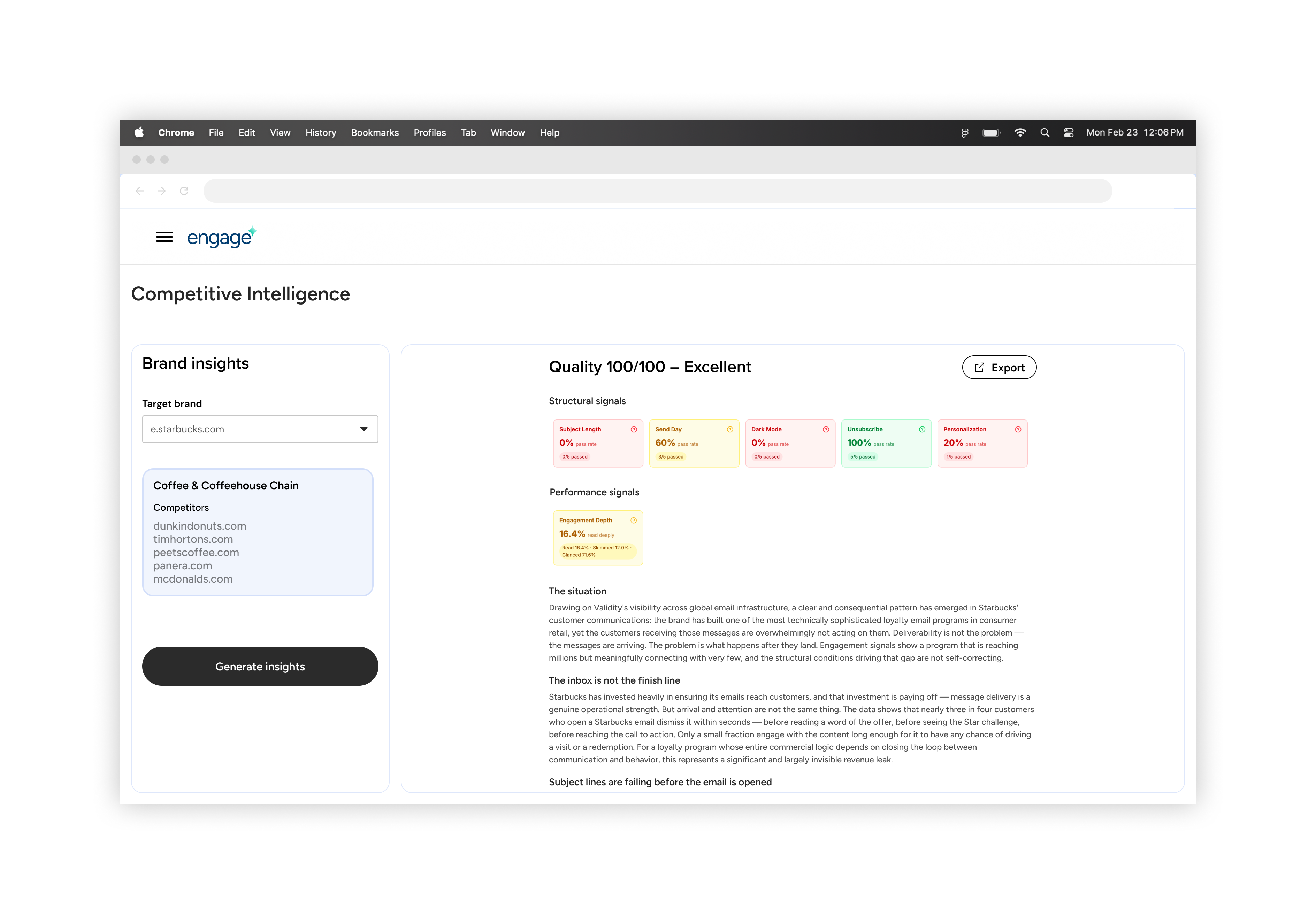
Behind the scenes, our data science team built and trained an LLM to create an internal tool to explore insights we could provide.
The output categorized signals into what was and wasn't working and included a verbose summary of the selected competitor with email examples based on the LLM's findings.
This tool formed the foundation of our MVP experience and helped me learn more about our data and possibilities.
Getting Started for MVP – Team Alignment

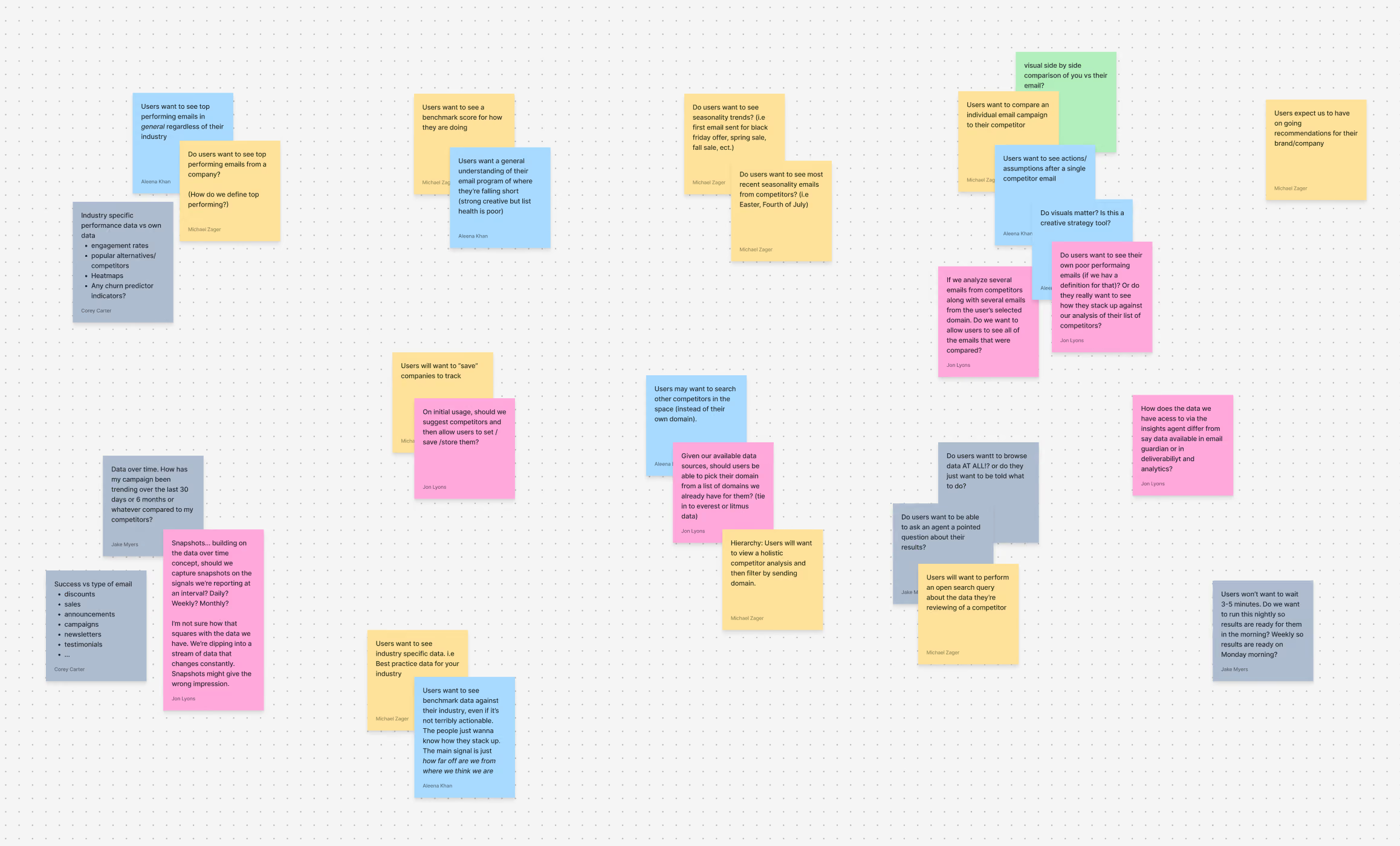
After a walkthrough of the Validity Intelligence Network and the proof-of-concept tool, I held a two-day assumption-mapping session with developers, data scientists, and a PM to ideate and align on the core assumptions we would design and build our agent experience around.
From the Workshop
After taking a look at the competitive landscape and ideating, we had our "leap of faith" assumptions that we wanted to focus on and later validate with users as an MVP for the market intelligence agent:
Users will want to see relevant insight data for specific industries vs. an individual company
Marketers already follow their competition in some manner, but struggle to see the larger picture in their industry and how it is moving.
Users care more about overall email strategy from competitors than individual journeys
Journeys refer to an email journey (e.g., the checkout experience), and the team believed competitors' positioning in the landscape would be more valuable.
Users want "low effort" email strategy recommendations
Bite-sized, easily digestible findings would be more impactful, implementable, and measurable for marketers as they work on their email strategy.
With these assumptions the team was aligned as I started to design the agent experience.
Anchoring the MVP Features
For the MVP, the team focused on enriching the data we had from the internal tool and making it valuable and digestible for users. We hypothesized the tool would be powerful only if the information we provided was accurate, relevant, and actionable.
The team anchored around three core features for launch that address our assumptions:
Featured Insights
A weekly roundup of 6 insights the LLM ranks based on a user's tracked brands.
Custom Insights
Controls that let users specify what the LLM should look at in their industry and be notified the moment it happens.
Signal Feed
Real-time signals for what is happening in a user's email marketing landscape.
Below, I'll take a closer look at designing and implementing featured insights for the market intelligence agent.
Key Considerations
Featured insights are the first thing users see when they land in the tool. I needed to design a feature users would see value in right away.
1. What type of information does an email marketer care about in their strategy?
I reviewed previous user calls, aggregated qualitative data, and consulted internal expertise to determine what information matters to a marketer's strategy. I found that users were primarily interested in broader industry practices, emerging trends, and how their email programs compare to competitors.
2. What information can the LLM accurately pull for the insights?
The internal agent scored companies on 6 key categories, including email send day, subject lines, engagement depth, personalization, dark mode, and unsubscribe. These categories formed the foundation of the featured industry report. I also explored the agent's prompting capabilities and found the agent could reliably pull top-performing emails, generate head-to-head comparisons, recognize industry shifts, provide recommendations, and more.
3. How can a user dive deeper and interact with an insight after generation?
I designed and added a core UX loop and conversational experience to each AI agent, letting users explore insights more deeply, ask follow-up questions, and tailor the information to their specific needs.
4. How do insights consume credits? How can we ensure users want to continue consuming credits?
Development improved the agent workflow in Mastra to reduce the credit cost of generating insights, and continuous discovery helped me identify opportunities to keep users generating insights.
The Core UX Loop
The team brainstormed what information would matter to users based on my findings and devised a core loop to serve as the basis for featured insights.
The loop included generating insights based on a user's company and tracked brands, then allowing the user to click on the card to learn more, or clicking on a prompt pill to kick off an AskEngage response.
The insight itself would include the following:
- An LLM-generated header element
- A core metric (expressed as a whole number or percentage)
- An LLM-generated "prompt-pill"
To speed time to value, our team set up a user's company and the tracked brands needed to run a featured insight report internally on the back end, then later turned it into a front-end feature for users. We prioritized whether the insight information was valuable and accurate for users.
AskEngage
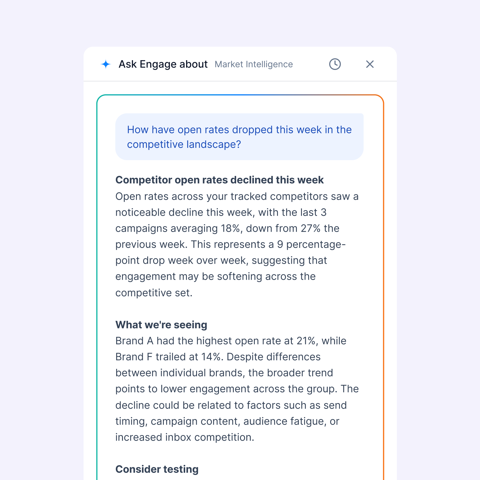
AskEngage is a feature we paired with all agents, allowing users the freedom to ask questions based on our Validity Intelligence Network.
It served as a core mechanic for credit consumption and a foundation for deeper dives into featured insights.
My Design Process: Building with Claude + VS Code
The product team had Claude licenses for their design needs, and we developed live-coded prototypes in a separate repo, hooked up to our design system. This was a fantastic way to move fast and iterate quickly to get a proof of concept in front of users.
This was my first time implementing an AI-driven workflow into my personal process, and I wanted to highlight some points from my experience:
Pros:
- Ability to iterate extremely fast and efficiently.
- Real interaction states and responsiveness for features gave me better control and understanding of expectations in a live production environment.
- Team buy-in. Because WIP designs were a build, I felt the team and outside stakeholders had a better understanding of the product vision and direction compared to viewing a static Figma file.
Cons:
- Convoluted feedback loop and visibility for the larger R&D team. We found it difficult for the team at large to see what designers were working on week over week. We solved this by creating a living webpage with our branch history and implementing a branch naming convention.
- Claude artifacts. When working on a new branch, I found Claude would not transfer everything I needed from a previous branch. I hypothesize we can fix/improve this by building a better Claude design skill.
- Handoffs. Because the designer's repo was separate from production, I experimented by handing off features by exporting branches. My squad found this was as time-consuming as using the Claude MCP in Figma.
While working on the Market Intelligence features, I wireframed concepts in Figma, translated the wireframes into a buildable prototype, and iterated in VS Code based on team feedback.

Concepting Card Designs
Once I had the parts kit for a feature insight, I started concepting designs for the card's look and feel. At the time, we didn't have a finalized brand or UI direction, so I used it as an opportunity to push boundaries and have an open discussion with the product team about Engage's look and feel. While designing, I considered the visual hierarchy, the interaction of clicking a prompt pill, and the dashboard layout, since work on custom insights and the signal feed was starting soon.

Claude
Claude helped me rapidly explore visual direction and iterate on placement of the core components of a featured insight card. I was easily able to pull these cards back into Figma via their MCP to utilize for future exploration.

Exploring Featured Insight Page Layout
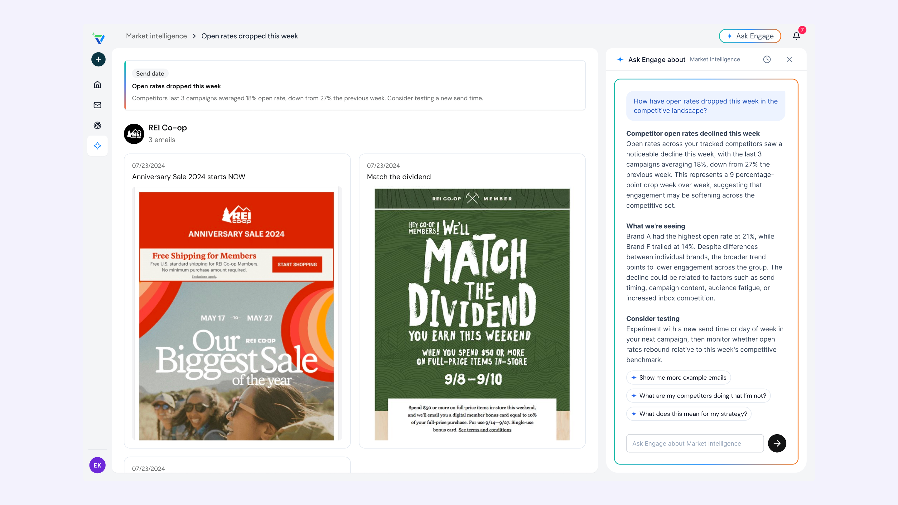
Users could click a featured insight card to explore relevant email examples the LLM pulled and chat with AskEngage to dive deeper. I explored the layout, how users could ask additional questions, and the page content.
From exploring our internal tool, I knew our LLM could do more than just pull email creatives. I also used this opportunity to push the types of content we could pull from featured insights, such as data visualization charts, rankings, and more.
Insight Page Decision
Implementing any data visualization or charts would significantly increase data enrichment and development work, so the team decided to focus the MVP on organizing and displaying email creatives, with the ability to dive deeper into insights using AskEngage. Charts, rankings, and other information would come later. We wanted to stay diligent and focus on our core vision.
Addressing Feedback
Our feedback loop included key stakeholders from the leadership team, SDRs, AMs, and Engage beta users. We aggregated feedback in a Slack channel, and I created a Claude project to capture recorded calls from our sales development and account manager teams.
Insight quality skews quantitative. There's no coverage of qualitative strategy shifts like new product launches, positioning changes, or shifts in who a brand is targeting.
The first iteration of insights required some form of quantitative number, limiting what the LLM could pull, like strategy shifts and new campaign launches. In this next iteration, I wanted to remove the quantitative aspect and rely on a title + subheader.
Insights aren't organized by how actionable they are. Positive findings (keep doing this) and negative findings (a competitor is outperforming you) get no visual distinction, and easy wins get buried next to harder, more strategic findings.
I looked at how I can add visual distinction to the card UI so users can easily understand the insight.
Users are forced into a fixed count of six cards even when only two or three findings are genuinely fine.
For the initial report, we required the LLM to always generate 6 cards, forcing insights that weren't valuable to users and costing us unnecessary credits. With this change, I wanted to review different layout structures and hierarchy for the section
Lean into email!
With no visual indication of email creatives, users hesitated to click on an insight to explore more. Adding thumbnail views of the emails the LLM pulled seemed like an easy win.

Additional Card Exploration
This round, I used a mix of Claude and Figma wireframing to explore a variety of additional layouts and card designs for featured insights.

Where I Landed
After another round of exploration and feedback, the insight cards stripped back any "AI-gradient" coloring to reduce clutter for users. Cards included logo previews, email creative thumbnails, and a more dynamic label, heading, and subheader for better content clarity. Prompt pills were removed from the card UI and replaced by an action footer with an explore link and bookmark icons. When users click the link, they're taken to the insights page, and the AskEngage panel starts an LLM response so they can go deeper into the insight.

The Outcome
The team launched three core features for the agent to help email marketers keep a pulse on what's happening with their competitors and in the industry. Saving hours of competitive research while delivering insights and recommendations to improve email program health.
What I Learned
Ship fast to learn
Building a 0-to-1 product and finding product-market fit means you'll miss the mark a couple of times, and the only way to figure it out is by shipping and learning. Then repeating the process 20x.
Tight-knit collaboration
Two other product designers were building different agent experiences on the Engage platform. We needed to stay in constant communication, discuss Engage's look and feel, collaborate on product direction, and standardize design system patterns.
If I Had More Time
Make insights more actionable for users
Users noted that insights weren’t as actionable as they would like. Users could digest the information, save it for later, and even download the findings for their own needs. But the agent wasn’t telling users how the insights were fitting into existing marketing strategies.
Meet the user where they are working
Internal workflows are evolving at companies, and I believe it's important to meet users where they are. What would it look like to receive featured insights directly in Slack? Or be able to chat with our agent in a Claude project?
Continue to ideate on how to increase credit consumption for users
As the core business model, how can the market intelligent agent continue to deliver value while managing credit usage within an account's credit package? Can they upload their own email to run a competitive analysis and see what improvements to make based on our industry knowledge?
Track core metrics to inform product direction
- Credit consumption by feature
- Time-to-value from sign-up to first featured insight report generated
- % of users who generated an insight and then interacted with AskEngage
More Projects
